-1280x720.jpg)
Aeromade Branding Guidelines
We set out to create an ongoing branding document that grows with the needs of Aeromade. For the initial development we needed a distinct visual identity that can set the company apart in a space full of cemented businesses and modus operandi.
Paul's professionalism, attention to detail, and exceptional skills have been instrumental in creating a cohesive and well-defined brand identity for our business.
Throughout the entire process, Paul demonstrated an exceptional level of expertise and communication skills, taking the time to listen to our needs and providing valuable insights and suggestions. The end result was a comprehensive and visually stunning branding guide that exceeded our expectations.
David @ Aeromade
Typography
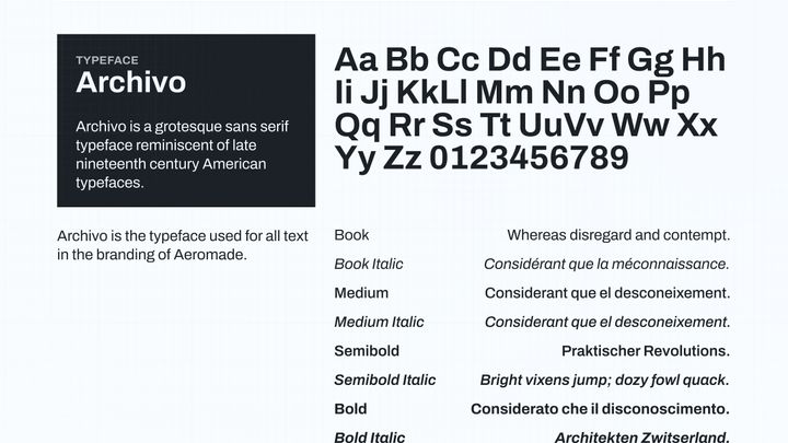
Our typeface of choice is Archivo due to it's strong features significative of bold innovation while also remaining easy to read and familiar to the established user base of the industry.
Logo
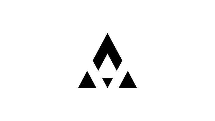
Our logo had to stand out and represent the manufacturing sector. We arrived at a symbol that represents a rocket with three thrusters, in light of new found optimism around the space travel development. The logo symbol also incorporates the A and the M from the name of the company into one.
Illustrations
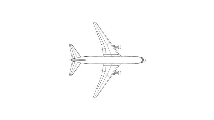
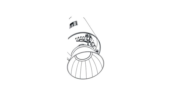
Illustrations allow us to provide some visual hierarchy while moving away from a standard suite of stock photos. We needed to associate our design with 3 distinct manufacturing sectors:
- engineering
- aerospace
- automotive
One of the pitfalls to avoid in this space is using stock photos that show other brands or their recognisable products.
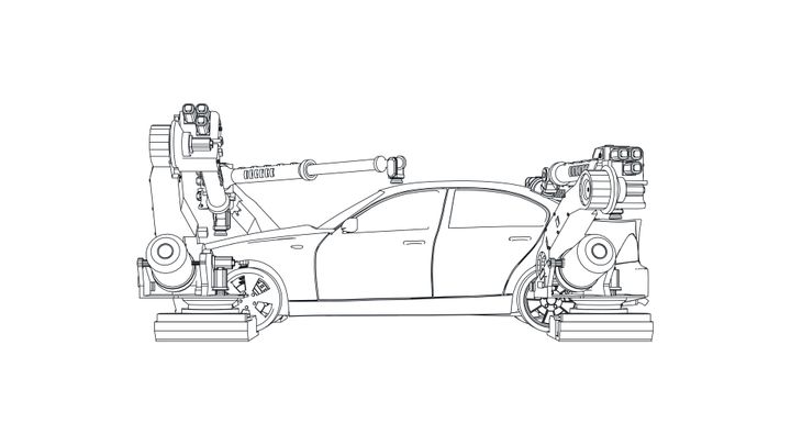
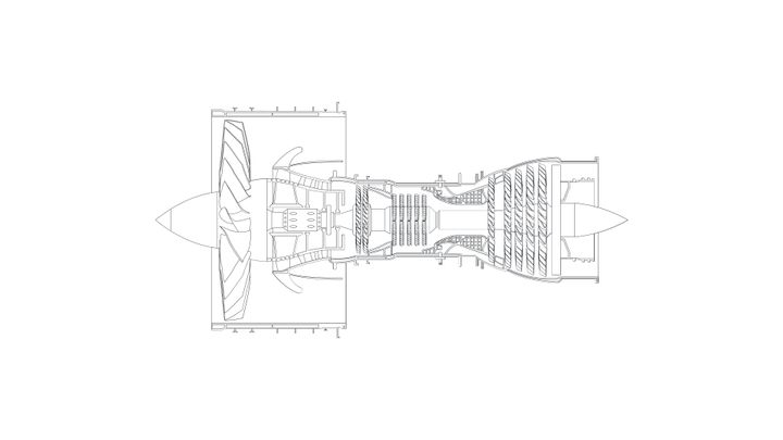
The end result is a strong living document to help the Aeromade team in scaling up their operations. We really stress the living aspect of the document because we can't predict the challenges the start up will face, so we remain agile and working closely with Aeromade to help them succeed.